Visual identity

TRANSIENCE will work together with key stakeholders from policy, industry, society, and research in an iterative co-creation process. Therefore, communication and exploitation lie at the core of the project to ensure a consistent, professional, and communicative outreach towards industry, policy, and academic audiences, facilitating the project’s communication, dissemination, and exploitation (CDE) activities, both internally (in all project communications) and externally (in all synergies or other related activities and events) as well as reaching out to a wider audience.
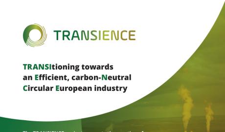
In this regard, the TRANSIENCE visual identity has been designed to correspond to the project’s scope, objectives, and outcomes, including elements and features that relate to its industry-facing orientation, in a unified and integrated manner. The circular shape used for the TRANSIENCE logo, represents the project’s open, integrated, and participatory aspects, and conveys the circularity principle guiding the industrial transition.
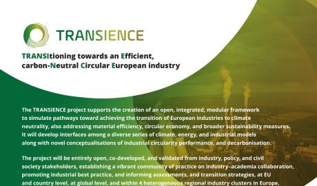
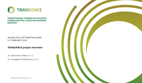
The structure of the TRANSIENCE visual identity comprises the colour palette and design elements that distinguish the project in all its promotional materials, as well as the project’s presentations and reports. This includes a flyer to create visibility (in English and partners’ languages), a leaflet for dissemination on objectives, methods, and expected results (in English and partners’ languages), a poster template for physical/online events organised by partners or relevant organisations as promotional material, a roll-up banner for policy or industry events, and a template presentation with basic project information to be regularly updated and adapted to any given event and audience.


